
Wednesday, 21 March 2012
Making of Props: Photo of victim

Making of props: Newspaper
 One of my shots required a newspaper article, it played an important part of giving insight into the storyline of the film as well as setting the mood. I orginally considered making my own newspaper from scratch however I later decided that it would be too time consuming. To make my newspaper article I got a hold of a real newspaper and glued on a picture of a crime scene and by make-believe headline. I had to play around with the font, size and colour of the headline several times in order to make it blend in with the rest of the newspaper (so that it didn't appear fake in shot). I did consider writing the actual article myself but I found that the writing wasn't visable in shot and therefore was unessessary.
Tuesday, 20 March 2012
Outdoor location shots

 This location is where the finale of the opening sequence takes place and the victim is murdered . This location was fairly easily to film in as there was no one else present here and nothing that would distract the audience's attention way from the main focus (the victim's fear and her death). All that was really required of this location was a surface for which victim to be pushed into, a brick wall could have sufficed however the advantages of using this fence is that it would not be painful for the actress to hit into multiple times (as we had to redo the shot several times to make it look as realitic as possible).


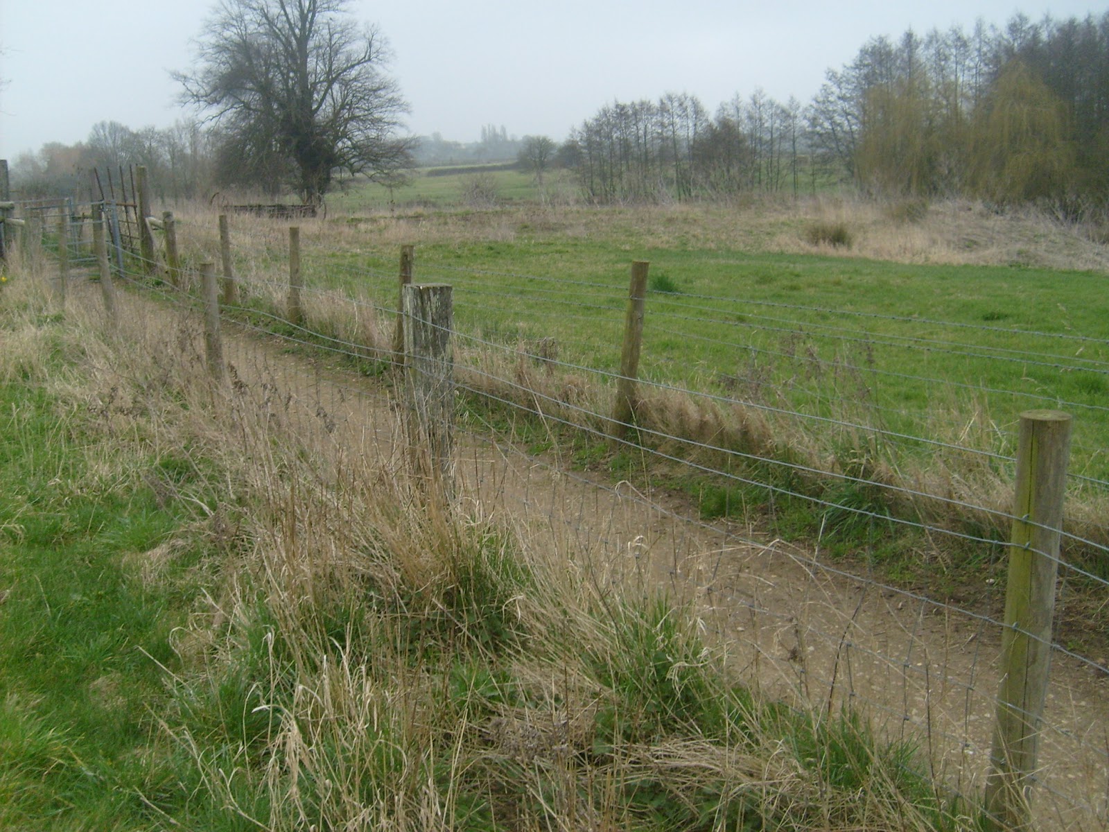
The counrty lane was selected for one of the beginning locations and specifically where the character of the victim was introduced. There was both advantages and disadvatages for this setting as the location provided a good space for a chase sequence with little distractions however there was the issue of passers by. Luckily I only had to stop filming once to prevent them from coming into shot and ruining the atmosphere.

Orginal Production Logo Idea

Making of Production logo
By looking at the production logo reseach I did (see previous post) I made the observation that the majority of the logo are literal representaions of the prodcution company name (e.g Lucky-Rose Films' logo features a four leaf clover, a rose and filming camera). I decided to follow the same approach, my film prodcution company is called Red Mist Productions and by using Vegas Movie Studio (which I am also using for the editing of my film) I managed to create a fuzzy red outline for my text, giving the illusion of red mist which was further emthasised by a red tinted background.

Thursday, 23 February 2012
Tuesday, 7 February 2012

Subscribe to:
Posts (Atom)